
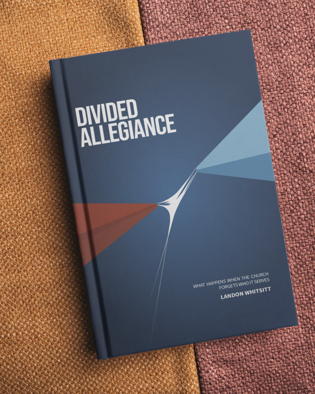
Divided Allegience
Client: Landon Whitsitt
Year: 2026
Role: Branding. Design.
For Divided Allegiance, I developed a visual concept that communicated the book’s message before a reader ever opened it. The cover centers on a thin, taut line as a metaphor for the tension created by competing allegiances, using restraint and simplicity rather than overly literal imagery. I carried that concept through the typography, color, and overall composition to create a distinctive identity that felt thoughtful, contemporary, and appropriate for the subject matter.
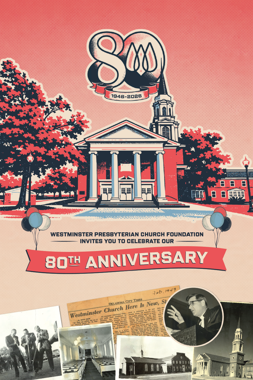
Invite (Front)
Design Inspiration
The visual language drew inspiration from the imperfections and texture of traditional print production, where overlapping inks create unexpected colors and depth. By recreating that effect digitally, the identity celebrated 80 years of history through a style that felt both nostalgic and contemporary.
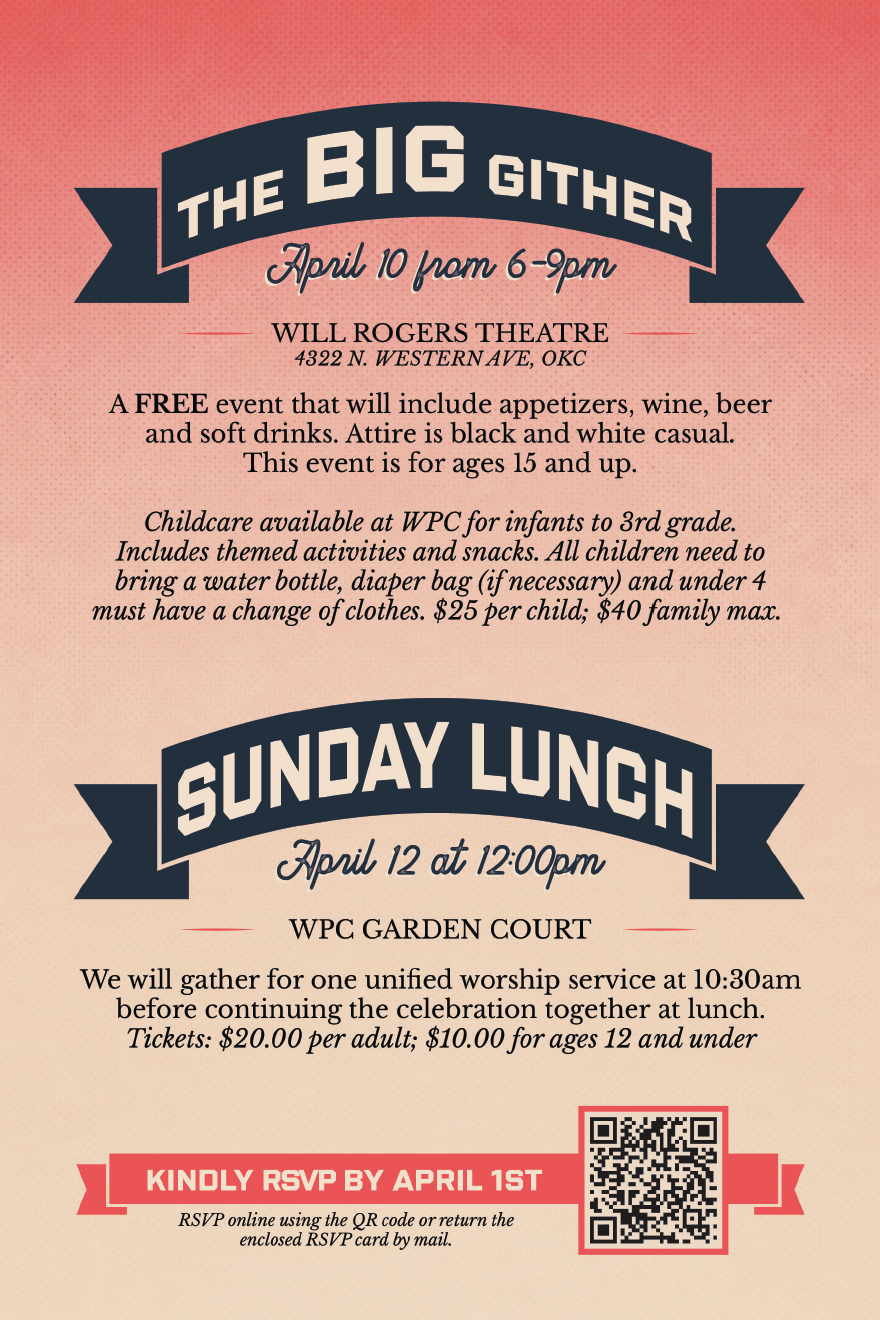
Invite (Back)
History Booklet
As part of Westminster Presbyterian Church’s 80th Anniversary celebration, I partnered with the anniversary committee to create a commemorative history booklet that documented the church’s legacy. After gathering historical content, photographs, and archival materials from multiple contributors, I organized and formatted the information into a clear narrative before designing a publication that reflected the anniversary’s overprint-inspired visual identity. From layout and typography to print production, I oversaw the project through its final printed form.