
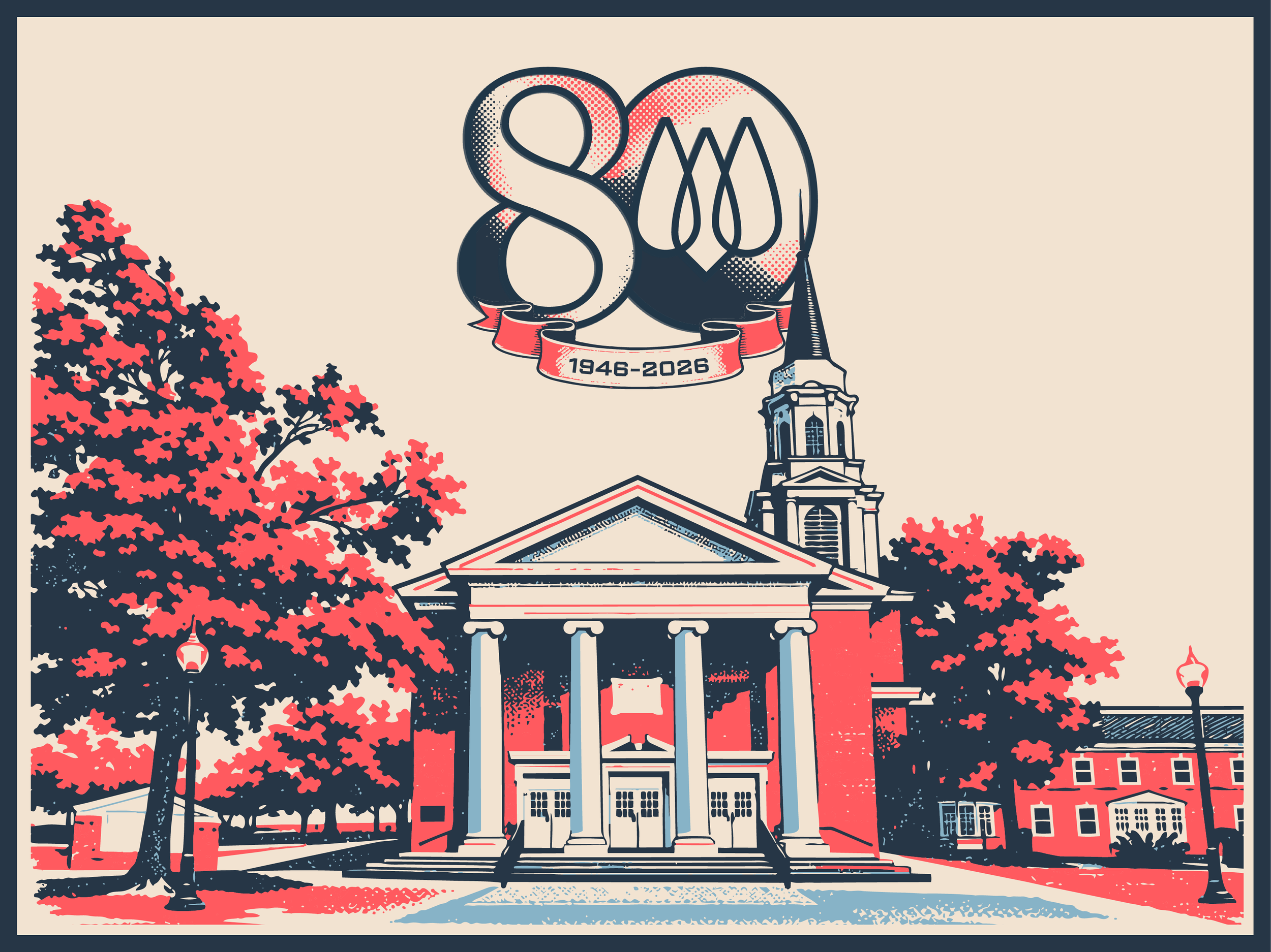
WPC 80th Anniversary
Client: Westminster Presbyterian Church
Year: 2026
Role: Branding. Design. Marketing.
For Westminster Presbyterian Church’s 80th Anniversary, I wanted the branding to feel rooted in history without looking old-fashioned. Inspired by traditional overprint techniques found in vintage posters and printmaking, I developed a visual identity built around layered shapes, transparent color, and bold typography. The result felt handcrafted and timeless while remaining clean, modern, and flexible across print and digital applications.
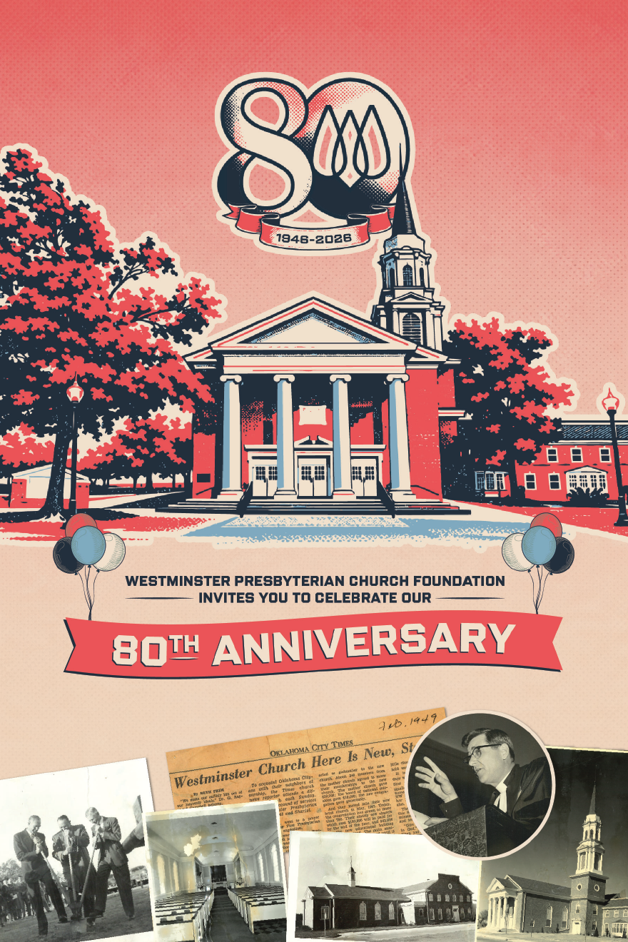
Invite (Front)
Design Inspiration
The visual language drew inspiration from the imperfections and texture of traditional print production, where overlapping inks create unexpected colors and depth. By recreating that effect digitally, the identity celebrated 80 years of history through a style that felt both nostalgic and contemporary.
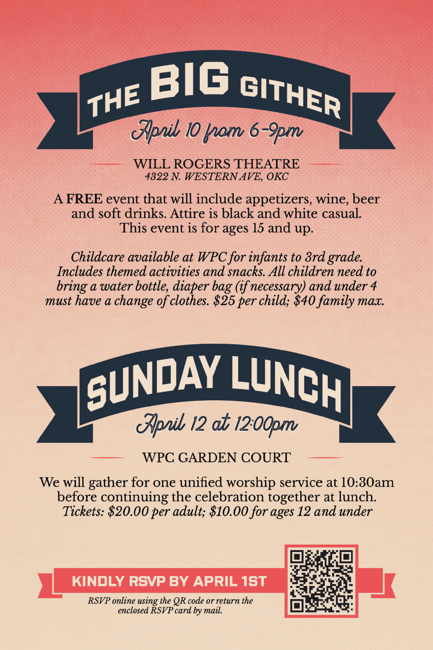
Invite (Back)
History Booklet
As part of Westminster Presbyterian Church’s 80th Anniversary celebration, I partnered with the anniversary committee to create a commemorative history booklet that documented the church’s legacy. After gathering historical content, photographs, and archival materials from multiple contributors, I organized and formatted the information into a clear narrative before designing a publication that reflected the anniversary’s overprint-inspired visual identity. From layout and typography to print production, I oversaw the project through its final printed form.